 Facebook
 X
X
 Pinterest
 Copy Link
I recently viewed a home in the Village of Oak Creek and another one in the Chapel area of Sedona. One of the rooms was painted bright red – Master bedroom and another bedroom was painted bright yellow. The staging trends for the last couple of years have been neutral colors. Walls mostly cream, light sand, or white because they make the rooms appear larger and darker colors or bright dark colors make rooms look smaller and depending on the color can also be depressing. Even the Lime Green & Bright Yellows are off putting for buyers & vacation rentals.
NAR magazine has this to say about paint colors.
Rethink a red-painted living room or dining area; red is the most off-putting color, according to a survey of home staging and design professionals conducted by the home remodeling site Fixr.com. “Red is an extremely strong color and may not be to everybody’s taste,” the study notes.
Fixr’s Paint & Color Trends 2024 report flags the following as the most off-putting colors to home buyers:
- Red: 53%
- Lime green: 53%
- Bright yellow: 40%
- Mustard yellow: 19%
- Pink: 10%
- Turquoise: 9%
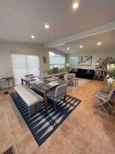
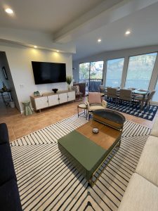
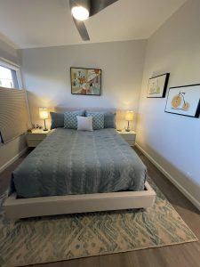
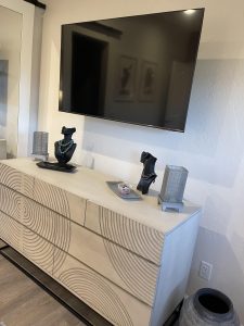
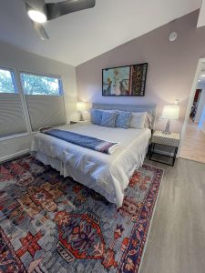
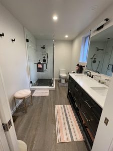
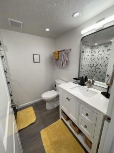
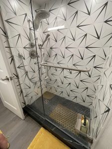
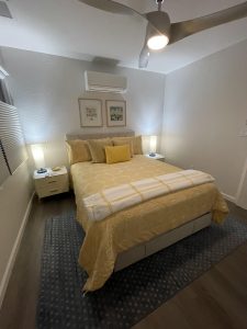
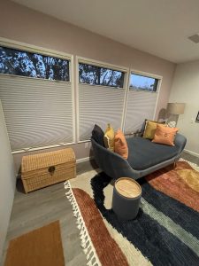
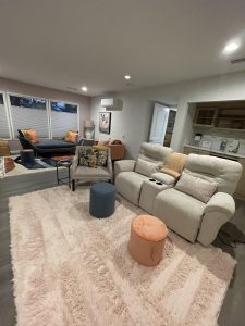
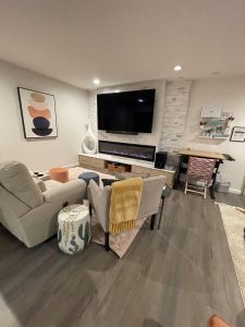
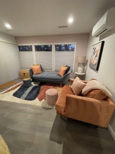
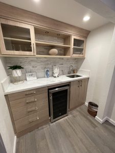
I recommend going with either a very light grey, light sand, very light pink or white throughout the house. One consistant color throughout the home is best. White ceilings are also best. Light & bright areas are less depressing and encourage happiness.
Then use color in the area rugs, furniture & art work. The neutral colors on the walls won’t need to be changed as often as the rugs, furniture and art work. I’m attaching some examples of my recent redesigned vacation rentals to give you an idea of what can be done. My next blog will be about updates that are most cost effective in older homes or condos.
Happy New Year!!